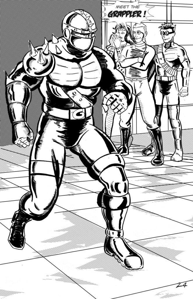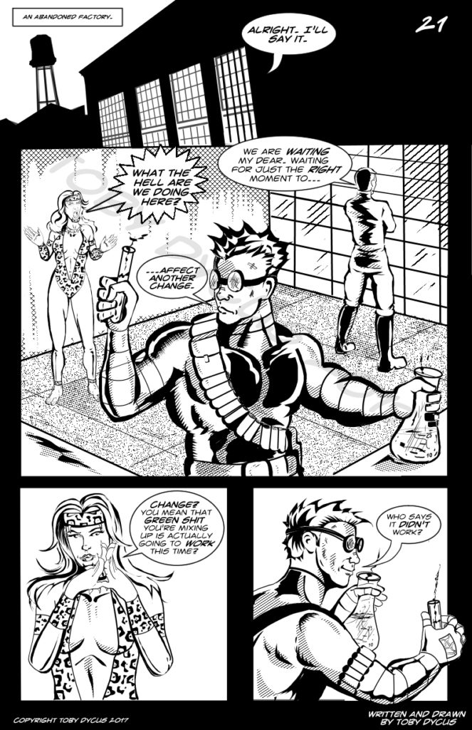
Whew! It has been a crazy and long journey to finish Nightstik #4. It was originally supposed to be a short story about Nightstik’s powers. It grew into something else entirely! I’d like to thank the dozens of people who are not related to me for sticking with my comic and all of the support […]

This page was supposed to be a lot simpler than it ended up being. But here it is for my faithful 12 readers! Enjoy! Toby Dycus

Back in 2002, I actually took the time to sketch out Nightstik’s studio apartment. This two-page spread is based on that rough sketch. It was incredibly tough to draw! Who knew a stove could take so long? The idea I’m trying to convey here is that Nightstik’s place is SMALL. He has no secret hideout. […]

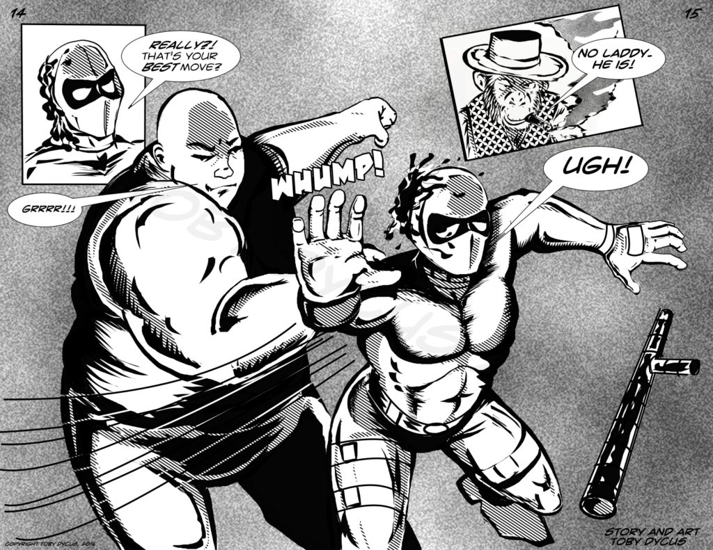
The obligatory two-page spread! Can even Nightstik take down this behemoth? Tune in next week and find out! In a slightly unrelated rant, I went and saw Rogue One this weekend. No spoilers here, just an observation. Everyone in the Star Wars Universe is a shitty parent and/or really bad at relationships. Allow me to […]

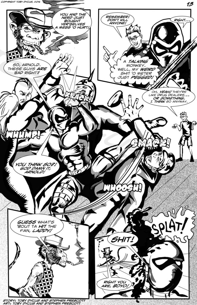
Welcome all 12 people still reading not directly related to me! I had never drawn a bar brawl. My partner in crime introduced the talking monkey into the situation and suggested the poop throw. Not only that, he contributed art for 3 of the five panels, so that garners him an art and story credit. […]

This page came together fairly quick. I will admit I made liberal use of photo references for the skin cell design, and the figures. Enjoy!

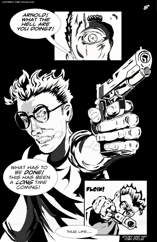
This page was a BEAR! The idea was simple. A big dynamic splash page depicting what is seen on first person shooters all the time. Like I said. Simple, right? NOPE! The angle just wasn’t looking right. I twisted it. I turned it. I flipped it. At one point, I was drawing it upside down. […]

I don’t often pat myself on the back, but this page looks pretty good if I do say so myself.I’m a big fan of Frank Miller, and this page is definitely a homage to issue 184 from Miller’s run on Daredevil in the early eighties. A bit of background here. It was important to me […]

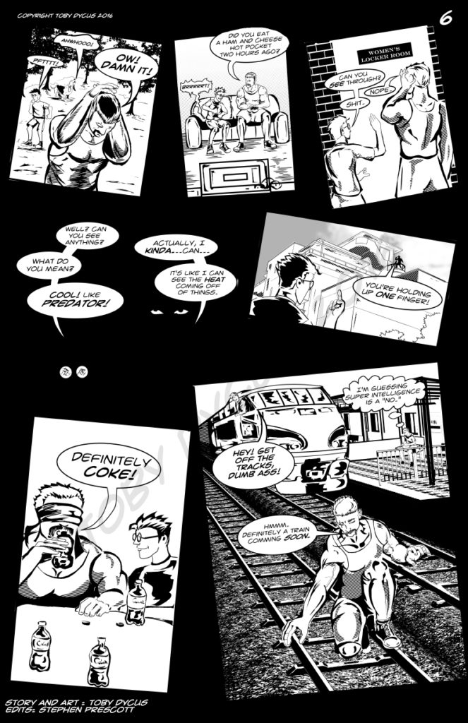
This was supposed to be an easy page. Five senses, five panels, right? Wrong. Five panels became six. Six became seven. This is the danger of writing on the fly. Initially, this was to be a pretty straight forward layout, but the more I worked on it, the more I hated it. I had just […]

This page is a return to “traditional media.” I penciled this one out old school and inked it with a brush and a bit of pen work. The ground and lettering I did with Manga Studio. I wasn’t nostalgic enough to try and hand letter it. Update: My drawing partner suggested putting the ground into […]
