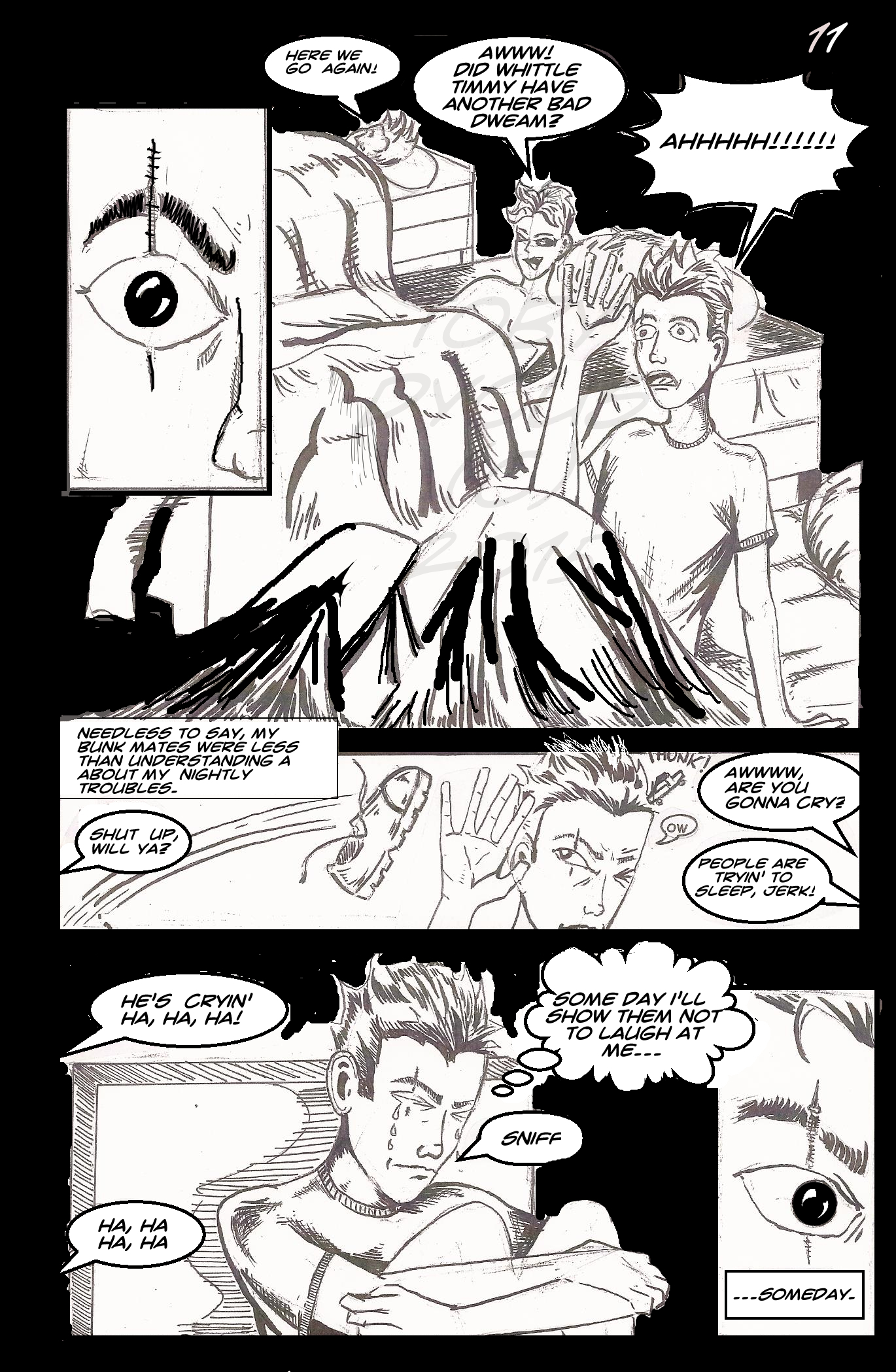
This is what I call a “Frankenpage.” So this was my process:
I drew this page in late 2002 in an 81/2 by 11 inch sketch book. Rather than re-draw it, I enlarged it to 11 x 17 on a copy machine. This was 2012. I than inked the page by hand and lettered it with the dreaded comic sans font. My lettering process involved printing my letters on label sheets and than cutting them out by hand and sticking them down like stickers. After learning that comic sans is for stupid people, I re-lettered it with the current Crime Fighter Font from Fontspace.
And then for my 40th birthday, I purchased Manga Studio and discovered that I could letter digitally.
This features new letters and a bit of “surgery” to repair the sections that had been torn up by my old lettering process. Graphically, I think it is a really interesting page, despite the fact that the blacks don’t quite match up.
Ah, well. That’s what growth is all about. Right?
